
A release page has a play button that never receives keyboard focus. For someone using a keyboard instead of a mouse, the music may as well not be there. A pale track list that fades into its background creates a different barrier. Website accessibility begins with these ordinary tasks: playing an excerpt, reading a review, finding a cassette edition.
It is not a visual style to apply once the site is finished. Accessibility depends on how pages are written, structured, designed, and operated. Readers may use a keyboard, a screen reader that announces page content, magnification, voice control, captions, or a combination. A broken mouse, a quiet room where audio cannot be played, or glare on a phone screen can also change how someone uses a page. Rather than guessing what an accessible site looks like, test the routes people take through it.
Start with one complete task
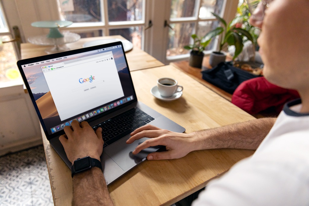
Pick a representative page: perhaps an album review with artwork, a track list, an embedded player, and a link to another review. Reach it from the homepage, find the title and sections, play and pause the audio, then return to where you started. Note exactly where you get stuck. That gives you a more useful first list of fixes than a collection of isolated errors from across the site.
Try the route using only a keyboard. Tab moves forward through links and controls; Shift+Tab moves backward. Use Enter or Space to activate controls where appropriate. You should always be able to see which item has focus. The order should make sense, and focus should not get trapped in a menu or player. If a dropdown opens, can you close it without a mouse? A visible focus outline is information, not a blemish to hide.
On a site with a long navigation menu, a “Skip to main content” link can spare keyboard users from tabbing through every menu item on every page. It can appear when it receives focus, but it must lead to the article itself, not back to the top.
Use page structure to explain the content
Headings help people skim visually and let assistive-technology users move through a page by section. Give each page a clear main heading, followed by subordinate headings in a logical order. A review might separate discussion of the recording, the physical edition, and listening notes. Do not use an h3 just because it looks smaller than an h2; change the styling without breaking the heading order.
Page titles deserve the same attention. A browser tab labelled “Untitled,” or just the site name, is hard to pick out when several tabs are open. “Artist and album — review | Publication name” identifies the page. Link text should also make sense on its own: “Read the interview with the label founder” says more than “More,” especially to someone hearing a screen reader's list of links without the surrounding paragraphs.
Let HTML elements do the jobs they were made for. A track list should be a list, not lines separated by decorative symbols. A control that plays or pauses audio should be a button; a route to another page should be a link. Native elements generally come with keyboard behavior and information for assistive technology that a clickable div lacks unless you add it yourself. Nor does a whole paragraph need to be clickable when its title will do.
Write for comprehension, not just navigation
Specific labels cut down on guesswork. “Play excerpt from track three” is clearer than several identical “Play” buttons when someone moves through a page by controls. Explain an unusual term when readers need it to understand your point, but keep the precision of music writing. You can discuss drone, electroacoustics, and field recordings without assuming every reader already knows what you mean.
Break up dense passages when the argument shifts. Keep essential information in page text, not solely in artwork or a promotional graphic. If a cassette photograph contains the only track list, transcribe it; readers should not have to decipher tiny lettering to find out what is on the release.
Make images useful without narrating every pixel
Alternative text supplies information an image conveys when that information is not available elsewhere. Its wording depends on the image's purpose. Beside a clearly printed artist and album title, cover art may need only a brief identification: “Cover of [album title] by [artist].” If the artwork matters to the review, describe the relevant detail—a blurred image of the outdoors or handwritten lettering, for instance—without inventing an interpretation. Usually there is no reason to repeat adjacent text word for word.
A decorative texture or divider can have empty alternative text so a screen reader does not announce something with no informational value. An image that acts as a link, on the other hand, needs text that explains where it goes or what it does. Skip filenames, strings of keywords, and “image of” unless identifying the medium as a photograph or illustration matters. Ask what a reader would miss if the image were unavailable.
Check contrast and flexible layout
Muted palettes can make music sites hard to read. A gray caption on charcoal may suit the design but still disappear for some readers. The Web Content Accessibility Guidelines, or WCAG, give contrast targets: the widely used AA target is at least 4.5:1 for ordinary text and 3:1 for large text. Essential interface graphics and component boundaries generally need 3:1 contrast against adjacent colors. A contrast checker can measure a color pair; also inspect text over cover art and gradients, where the background changes.
Color should not carry meaning by itself. If available editions are green and unavailable ones gray, add “Available” and “Unavailable” in text. Links in paragraphs should be recognizable without a subtle color difference; an underline is usually clearest. Hover effects are no substitute, since touch and keyboard users may never see them.
Enlarge the text and narrow the browser window. People may zoom substantially or increase text size to read a long essay. Text should wrap instead of running off-screen; buttons should not cover paragraphs; and an ordinary reading page should not require sideways scrolling because of its two-column layout. Fixed-height boxes often clip enlarged text. On mobile, give controls enough room that a reader is not likely to hit the neighboring link by mistake.
Give audio and video more than one route
A music page poses a particular question: what information in the audio can be made available to someone who cannot hear it? Transcribe spoken material, whether it is an interview, an introduction, or a spoken-word passage. Video captions should include speech and significant sounds that affect understanding. Automated transcripts offer a starting point, but check names, release titles, and unusual vocabulary against the recording.
Instrumental sound cannot be fully transcribed into words. A description can still give relevant facts: the excerpt's duration, whether it opens with a low sustained tone or sharply intermittent noise, and when a major change occurs if the review discusses it. Such text does not replace listening. Keep the review's analysis in readable page text rather than inside the player alone.
Test every player control with a keyboard: play, pause, volume, seeking, and any playlist functions. Controls need names people can understand. Do not start audio automatically. Unexpected sound can interfere with a screen reader, disturb someone nearby, or send a reader hunting for pause. If a track has accompanying animation, avoid flashing effects and respect reduced-motion preferences where the site uses motion. Test embedded third-party players manually even if automated checks pass elsewhere. You may not control their code, but you can decide how they appear and put essential context outside them.
Use standards as a guide, not a substitute for testing
WCAG groups accessibility requirements under four principles: content should be perceivable, operable, understandable, and able to work with different browsers and assistive technologies. A beginner need not memorize every criterion at once. Ask whether readers can perceive the article and its controls, use them without a mouse, understand labels and errors, and access the page with assistive technology. The standards set a shared target; testing shows where a particular site falls short.
Automated audits can find missing image alternatives, some contrast failures, unlabelled form fields, and structural mistakes. They cannot reliably judge whether alternative text is useful, headings form a coherent outline, or an audio control is maddening to use. Check each reported issue on the page before making a change. A tool can also report no errors while a menu remains unusable by keyboard.
A manageable first-pass audit
- Pick three page types: an article, an archive or search page, and a page with an audio or video player.
- Complete a keyboard route: start at the top, reach the main content, operate controls, and check that focus stays visible.
- Inspect structure: check page titles, heading order, link names, lists, image alternatives, and form labels.
- Test presentation: check contrast, increase zoom, narrow the viewport, and look for clipped content or overlapping controls.
- Check media: review captions or transcripts for speech and test player controls without a mouse.
- Record and retest fixes: note the page, barrier, and affected task, then repeat the route that revealed the problem.
If the site has a search box or newsletter form, give every input a visible, associated label. Placeholder text is not enough: it vanishes when someone starts typing and may be hard to read. Error messages should explain in words what needs correcting, close to the relevant field, rather than marking it red and leaving readers to guess. After submission, make success or failure clear.
Fix the barriers that stop a task before smaller inconsistencies. A player that cannot be paused, a menu that traps focus, or a search field without a usable label needs attention first. Keep a brief record of each fix in case a theme or player update brings the problem back. When the next review goes live, tab from its title to the audio, pause the excerpt, and check that the focus indicator is still visible on the pause button.