
An artist with a recording to share may abandon a submission form that demands their legal name before it accepts a listening link. The editor never sees the pitch, so the problem can go unnoticed. On an independent music site, forms often stand between readers and a small editorial team, handling pitches, corrections, event notices, and contact requests. Each should ask for what that message actually needs.
Start with the job the form has to do
Before adjusting labels or colors, follow the message past the Submit button. Who receives it, and what do they need to respond? For a shared editorial inbox, a name or chosen identifier, an email address, and a message may be enough. An event notice may also need a date, venue, city, and link to confirmed details. A correction needs the page in question and a description of the error.
Keep those jobs separate if you can. A twenty-field form makes a quick correction feel like an application. If maintaining separate forms is impractical, use a short purpose selector and show only the relevant fields. Leave a plain message box available if the conditional fields fail to load.
For every field, ask: what decision becomes harder without this answer? If you cannot name one, remove the field or make it optional. A publication rarely needs a postal address to reply by email. For an initial pitch, a listening link and a few sentences may tell an editor enough to decide whether to follow up; a press kit upload can wait.
Make the first screen explain the exchange
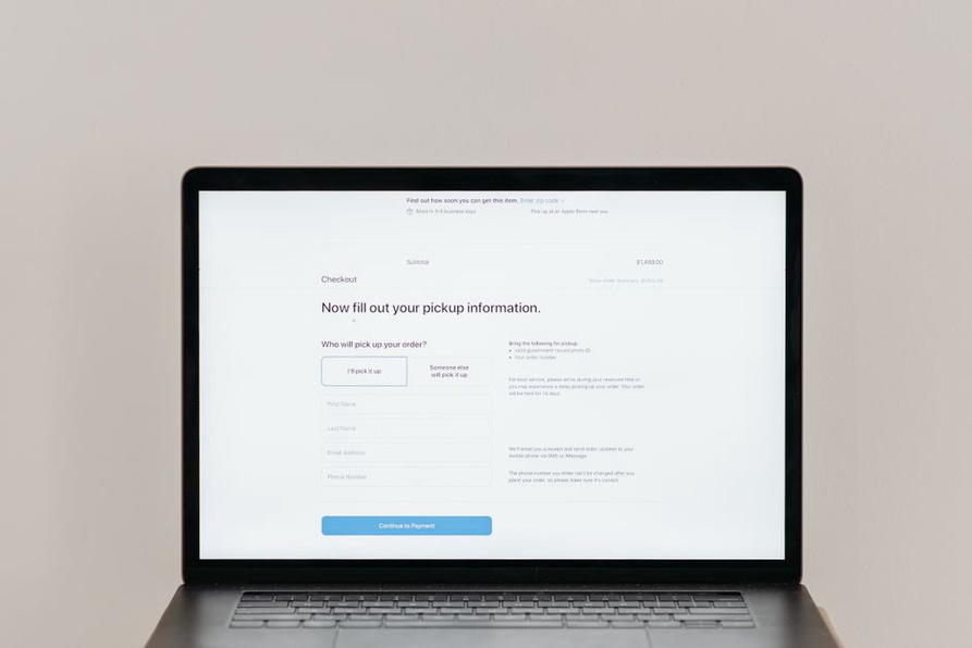
“Contact” identifies a page, but it does not tell anyone what to send. Add a sentence such as “Send corrections, questions, or editorial pitches to the site editors.” Do not promise a reply if one is not guaranteed. Give a realistic response window if you have one; otherwise, say submissions are reviewed as time permits.
Put unusual requirements beside the field they affect, not in a distant FAQ. Beside a listening-link field, explain whether private links are welcome and where to include a password. If the site cannot take attachments, say so before someone prepares one. A DIY release may have no conventional press page to fall back on.
Use labels that stay visible
Keep labels such as “Email address,” “Listening link,” and “Your message” visible beside or above their fields. Placeholder text vanishes as people type and can look like an example rather than an instruction. Mark optional fields “Optional,” and identify required ones in words rather than relying on color or an unexplained asterisk.
Fit the control to the answer: a multiline box for a pitch, a date field when an exact date matters, an email field for an address. Do not impose a narrow link format when a project page, streaming page, or private audio link would all be useful. If a format rule is unavoidable, show an example before submission.
Reduce effort without losing useful context
Shorter is not always easier. “Tell us about the release” can demand more thought than a few focused prompts. An editorial pitch might ask for the artist or project name, a listening link, what is being submitted, and why it may fit the publication. Leave room in the message field for anything the fixed fields miss. Someone working with field recordings or electroacoustic sound should not have to pick “rock” or “electronic” just to continue.
Use free text when categories would misrepresent the answer, without asking for an essay on a routine request. For a correction, the page address and proposed change may suffice, with an optional source or explanation. If you need sensitive information, explain why. Do not collect a private phone number just because the form builder offers that field.
Be careful with uploads. They can be slow on mobile connections, reject unfamiliar formats, and bring unwanted files onto the site. If an upload is necessary, show accepted formats and size limits beside the control. For an initial music pitch, a link is usually easier for the sender and editor; the site can request a file later.
Make errors easy to recover from
When a submission fails validation, keep the entries in place. Put a clear error beside the affected field and, if several fields need attention, a short explanation at the top. “Enter a listening link” tells someone what to fix; “Invalid input” does not. Avoid rejecting a submission because a name contains punctuation or an address fails an unnecessarily strict format check.
Give feedback while people fill out the form when it helps, but do not flash an error the moment they start typing. After submission, move attention to the result so keyboard and screen-reader users can find it. The overview of the Web Content Accessibility Guidelines gives background on accessible web content. In a form, that means clear labels, understandable errors, and controls that work without a mouse.
A server failure needs an honest message: the form did not send. Where possible, keep the text so the visitor can retry or copy it. Never show a success message for a submission that was silently dropped.
Check the form on a phone and with a keyboard
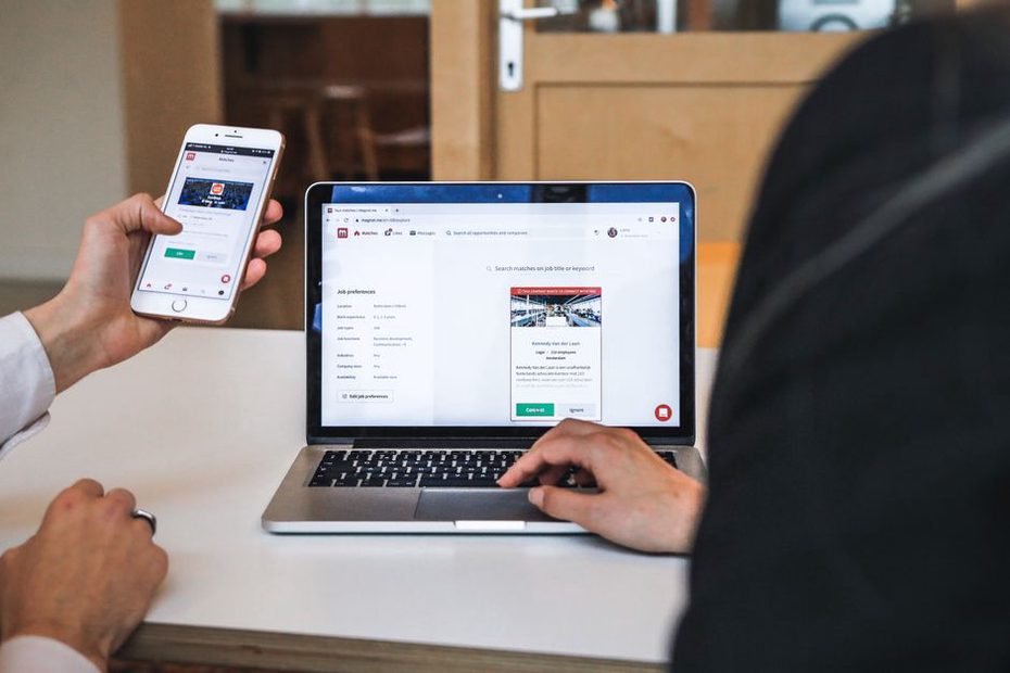
A narrow screen exposes problems quickly: labels can overlap inputs, instructions can drift away from their fields, and a large attachment control can push Submit out of sight. Test on a real phone, not only in a resized desktop browser. Type a long project name, paste a link, correct a typo, and submit with the on-screen keyboard open. Check that text stays readable when zoomed and controls are easy to select.
Then complete the form using only a keyboard. Focus should stay visible, Tab should follow a sensible order, and conditional fields should not trap it. If there is a spam check, make sure keyboard users can still submit. A hidden technical safeguard may cause less friction than a puzzle, but test either approach for false positives.
Write a confirmation that answers the next question
Show an unmistakable confirmation after a successful submission. “Your message was sent to the editorial inbox” says more than “Done.” If editors reply only when they want to follow up, say so. A server receiving a pitch is not the same as an editor accepting it. An optional confirmation email can give the sender a record, but do not repeat sensitive message content without a reason.
Make sure notifications reach an inbox someone checks. Test that replies go to the sender, not an automated site address, and decide who handles messages when the usual editor is away. A good confirmation screen is little use if the inbox is abandoned.
Test with realistic submissions, not empty fields
Try the form as a reader correcting a misspelled artist name, a musician sharing a private listening link, and someone sending an event date from a phone. The correction should not demand a biography. The private link needs a place for its password. The event sender needs to know which date details are required.
Check where each message lands, whether line breaks survive, and whether links work in the notification. Try leaving a required field blank, then submitting over a slow connection. If spam becomes a problem, measure it before putting more obstacles in everyone’s way. Rate limits or filtering may help, but inspect rejected messages so legitimate pitches are not lost without notice.
Keep a dated message in the editorial inbox with a subject such as “Form test: correction.” It proves the route worked then, not that it will keep working. After a site update or mail-setting change, send another test with a page address and two lines of text. Check that it arrives in the right inbox with both lines intact.