
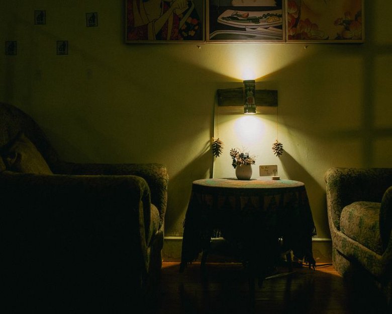
A white paint chip can look clean under a store’s bright lights, then turn gray beside a north-facing window. The paint hasn’t changed; the light has. In a dim room, window direction, nearby buildings, lamps and even the floor all affect how a wall color reads. Start by watching the room rather than hunting for one shade that promises to brighten it.
Find out what kind of light the room actually has
“Limited light” can describe very different rooms. One gets cool daylight all day; another catches a short burst of sun. A neighboring wall may block the window, or there may be almost no daylight at all. In the Northern Hemisphere, north-facing rooms often receive cool, indirect light; in the Southern Hemisphere, the orientation pattern reverses. A west-facing room might stay dim until late afternoon, then turn warm and bright. Compass direction is a clue, not a substitute for looking.
Check the walls in the morning, at midday and after dark with your usual lights on. Where do shadows gather? Does a neighboring surface cast color into the room? A pale wall opposite red brick, for example, may take on a faint warm cast. Notice whether the ceiling looks brighter than the walls, too. Heavy curtains, deep window recesses and dark furniture can matter as much as orientation.
Think about what you need the color to do. In a workspace, it may help to keep walls visually distinct from the desk and shelves. A bedroom used mostly in the evening needn’t look bright at noon; a deeper shade might make the low light feel deliberate. Paint cannot create daylight, but it can change how the light you have feels.
Understand lightness without treating white as a cure
Paint manufacturers often publish a light reflectance value, or LRV, for each color. On a scale of 0 to 100, higher numbers generally mean more visible light reflected back into the room. It’s useful for comparing paints, but it cannot tell you how a color will look on your wall. Undertone, finish, furnishings and lighting still matter.
Brilliant white can be unforgiving where daylight is scarce. It may look flat or gray, and the contrast against a dark floor can make that floor feel heavier. A slightly deeper off-white, cream, pale beige or muted stone may feel more comfortable despite its lower LRV. You’re looking for a workable relationship between the walls, ceiling, floor and furniture, not the highest number on a chart.
There is no LRV cutoff for dim rooms. Switching from charcoal to a pale neutral will generally reflect more light. Between two similar off-whites, undertone may make a bigger visible difference than LRV. If a sample looks dull, consider its undertone or the room’s lighting before reaching for an even paler paint.
Choose an undertone in relation to the room
Put two similar samples side by side and their undertones become easier to spot. One beige leans pink; another looks yellow or green. A pale gray may reveal blue or violet beside a more neutral shade. In low light, those differences can matter more than the color name on the label.
Warm colors can soften cool daylight
Cream, warm white, gentle beige and muted clay can soften the effect of cool, indirect light. That doesn’t mean the walls need to look yellow. A sample that seems buttery on a card may feel much stronger across four walls, so compare a restrained warm neutral with one slightly richer option. If the room already has honey-colored wood or warm stone, repeating that warmth too closely may make everything run together.
Cool colors need enough definition
Blue-gray, sage and soft blue can suit a dim room, especially if you want it to feel subdued. Go too pale and gray, though, and the color may lose its character on the wall. A muted blue with enough depth to read clearly as blue can look more intentional than a nearly white blue-gray. Compare samples with the trim, floor and largest fixed surface—not just with each other.
Dark colors are an option, not a mistake
Deep green, brown, blue and charcoal absorb more light than pale paint, but a dim room does not have to be bright to work well. In a small room used at night, dark walls can give a sense of depth, provided there’s light where people read, work and move. Accept the trade-off: dark paint won’t brighten the room. If visibility comes first, plan around useful surfaces and lighting before settling on a deep shade.
Keep the room’s existing materials in the comparison:
- Dark floor: Try mid-light and light wall colors before assuming the palest white will balance it.
- Warm wood: Test warm and cooler neutrals beside it; either might look unexpectedly pink, orange or green.
- Colorful upholstery: See whether the wall sample makes the fabric look clearer or oddly muted.
- Little daylight: Judge samples under the lamps you actually use, not daylight alone.
Test paint where it will live
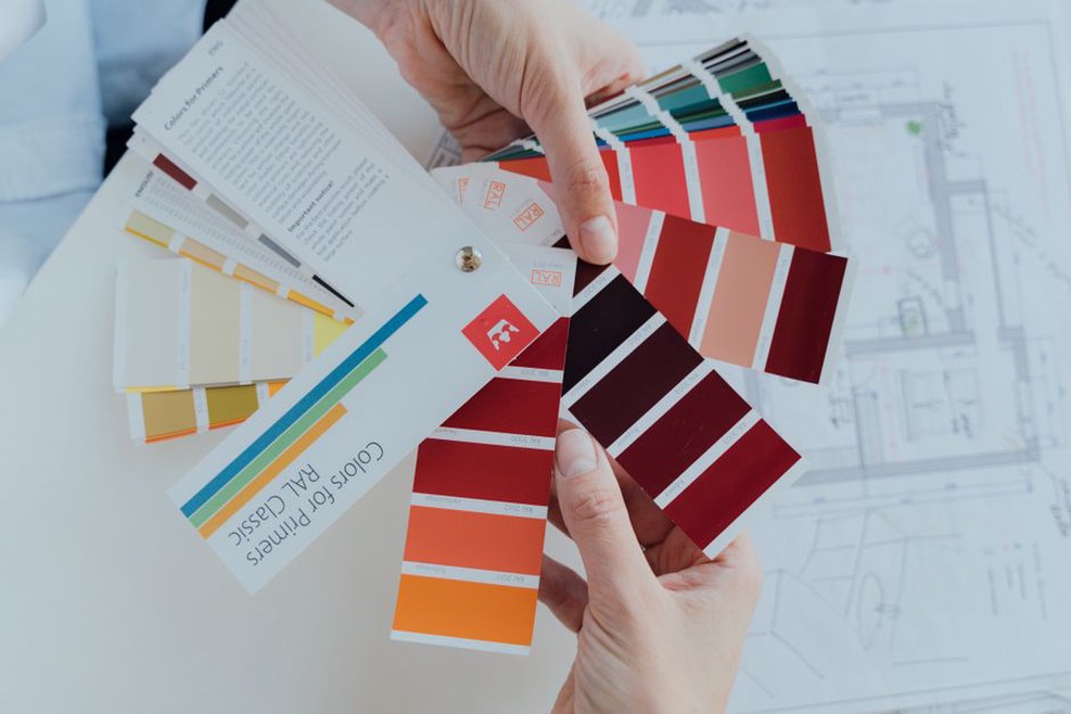
Small chips help narrow the field, but store lighting, white borders and the tiny patch of color make them poor final tests. Bring home a few candidates with meaningful differences in lightness or undertone. A stack of nearly identical samples often makes the decision harder.
Paint large, movable boards with two coats of each candidate, following the manufacturer’s drying guidance. Move them between a bright wall, a shaded corner and the area beside existing trim. If you sample directly on the wall, cover a strong underlying color consistently; old dark paint showing through can skew the result. Leave space between samples rather than making a patchwork of them.
Look at each board when you actually use the room. A color that pleases you at noon may look cold at breakfast or muddy under evening lamps. Hold the board vertically, since paint lying flat on a table receives light differently. Then step back to the doorway and see how it sits in the room as a whole.
Jot down plain observations: “warm at noon, gray at dusk, clean beside trim” is more useful than “nice.” Wait until the boards are fully dry; wet paint can look different, and products vary in how long they take to reach their final appearance. Sample pots may also differ in finish or formulation from the paint you’ll buy. Confirm your choice in the intended product and sheen.
Account for artificial light and paint finish
When daylight is limited, your lamps are part of the color decision. Paint chosen at noon may look quite different under warm bulbs at night. Light sources can also render colors differently even when they list similar color temperatures. If you mainly use the room after sunset, test under the fixtures and bulbs that will stay. Changing them later can change how the walls appear.
Several well-placed lights may help more than one brighter ceiling fixture. A floor lamp can reach a dark corner; a desk lamp can make a work surface usable without flooding the room. If you want to see the wall color at night, let some light fall across it. Watch for glare: a bare bright bulb can create one harsh spot while the rest of the room stays dim.
Finish matters, too. Matte paint tends to hide minor wall imperfections and can give dark colors an even look, though some products mark easily. Higher sheens reflect light more sharply and are often easier to wipe, but they can reveal uneven plaster or cause glare. Eggshell or another low-sheen finish is often practical in living areas; names and performance vary by manufacturer. Compare finishes under the room’s lighting rather than assuming shinier paint will make the walls look brighter.
Consider the entire painted envelope
A light ceiling can reflect light and keep the top of a dim room from feeling heavy. Painting walls and ceiling the same color softens their boundary, an effect some people like in small rooms. The ceiling may still look darker because light reaches it differently, so test it separately if that would bother you.
Trim changes the picture as well. Crisp white can outline doors and windows against deeper walls; trim close to the wall color makes a quieter transition. Neither adds daylight. Decide whether you want the edges defined or the color to continue uninterrupted. In a room with many doors, high-contrast trim may become more prominent than you expect.
Before buying paint for every surface, take stock of what won’t change easily: flooring, tile, countertops or a large sofa. Those materials set the terms for the wall color. A muted shade that looks unremarkable on its own may be the best fit beside a patterned floor.
Make the final choice manageable
Shortlist two or three colors and compare them under the same conditions. You’ll learn more from a light neutral, a warmer mid-tone and a deeper option than from three almost identical whites. If you can, leave the boards up for several days. A change in weather may show you something a sunny afternoon missed.
For the last check, put your preferred board beside the fixed surface you’re least sure about—a gray tile, dark timber floor or cream-colored door. Switch on the lamps you use at night and step back to the doorway. That’s the view, and the light, the finished wall will have to live with.