
A distorted photograph on a noise sleeve does more than illustrate distorted sound. Clipped whites and blocked shadows make parts of the image hard to recover, much as saturation can make individual sounds hard to separate. But the comparison only goes so far: the photograph stays still, while the recording changes over time. Looking closely at Japanese noise artwork means noticing both the resemblance and the visual artist’s decisions that have little to do with the sound.
That visual culture reaches beyond album covers. Flyers, cassette inserts, photocopies, stage arrangements and documentation photographs all affect how a work is encountered. They do not add up to a single national aesthetic. A carefully typeset edition and an almost illegible copied flyer can circulate in the same broad underground while serving different purposes and reaching listeners by different routes.
Surface is not just a metaphor
Noise is often described in visual terms: grain, scratches, static. Those comparisons become more precise when the method of production matters. Copy a sheet that has already been photocopied and fine distinctions tend to disappear. Dark areas close up, pale marks vanish, and new blemishes enter the next copy. This is not the same process as audio feedback or tape hiss, but it makes reproduction visible instead of concealing it behind a clean final image.
Imperfect reproduction can be practical, too. A high-contrast design holds up under cheap copying better than a subtle tonal photograph. Handwritten text can be added late; an image can be cut, moved and copied again without specialist printing equipment. Such constraints help explain rough surfaces in DIY music graphics without turning every rough mark into a manifesto. A storage scuff and a deliberately distressed image may look alike, but they have different histories.
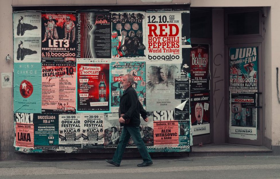
Legibility is part of the design. On an event flyer, a blurred background might leave the date and venue sharp. On an album cover, obscured lettering might keep the release unidentified until someone picks it up and turns it over. Neither choice guarantees an intense listening experience. Both govern how quickly information becomes available, and to whom.
The sleeve as an object in time
A small-format release has several surfaces: front, spine, insert, label, sometimes a handwritten addition. The order in which they appear matters. A cassette buyer might first spot the spine in a box, pull out the case, then unfold the J-card to find credits that need good light to read. Handling is part of the encounter; a square image on a screen cannot show all of it.
Scale changes what can be seen. Fine lines that look delicate in a scan may merge into a dark patch on a cassette insert. A striking cover posted online might leave out the plain back panel where the track information sits. When examining an edition, distinguish the artwork—the arrangement of images and type—from the artifact, including paper weight, folds, print alignment and wear. Those physical qualities can differ between copies of the same design.
Digitization strips away some of that sequence and imposes a new one. A streaming thumbnail shows the cover before any insert or label, often so small that texture collapses into a field of color. Archive scans and collectors’ photographs can restore detail, but they can also make damage on one copy look intentional. If a scan shows a stain, check another documented copy before calling it part of the artwork.
Credits deserve a second look
The musician is not necessarily the visual artist. A sleeve may involve a photographer, designer, printer or label organizer, and the credits may be missing or incomplete. This distinction matters especially with DIY work: collective production does not make every contribution interchangeable. If attribution remains uncertain, describe the visible choice rather than assigning it to the performer.
Reading images without hearing a genre cliché
Harsh noise need not look chaotic. Masami Akita’s work as Merzbow, for instance, has appeared in many formats with different visual approaches; no single sleeve represents the whole project. A dense collage can direct attention to accumulation, while a restrained layout can put distance between the object’s appearance and the recording’s volume. That distance may tell us more than a picture that seems to imitate the sound.
The reverse assumption is no stronger: a sparse design does not prove a recording is ambient or quiet. A nearly empty sleeve can frame an aggressive recording, and an elaborate image can accompany a piece built from small changes. Test an interpretation against specific properties rather than giving image and audio the same mood. Is there repetition in both the layout and the recording? Does the artwork conceal its source material while the audio exposes its sources? Where does the analogy fail?
Keep original artwork separate from later promotional images, too. A photograph of equipment posted years afterward may accurately show a performer’s tools without showing how the release looked when it first circulated. For background on the instruments themselves, DIY sound instruments in Japanese experimental music covers construction rather than sleeve design.
Performance images and their blind spots
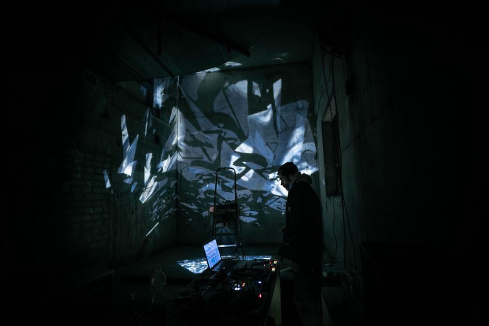
Photographs of noise performances favor gestures the camera can catch: hands on controls, cable clusters, speakers, bodies in motion. They can document an action, but not how loud the room felt or how sound changed across its corners. A dramatic frame may give a brief gesture undue weight. A motionless performer, meanwhile, may be making constant adjustments too small to register.
Placement still offers clues. A performer facing a table of devices creates a different line of sight from someone moving among microphones or speakers. Projected visuals, if present, might be synchronized with the sound, loosely responsive to it or entirely independent. A still photograph cannot settle that question without documentation of the setup. An image made at an event is not necessarily an image made for the music.
A workable method for looking
Visual analysis is more useful when the object, its context and the recording stay distinct. For a sleeve, insert or flyer, a few observations can prevent everything from collapsing into the claim that an image simply “sounds noisy”:
- Identify the version. Is it an original physical edition, a reissue, a scan or an event photograph?
- Record what is visible. Describe color, type, image sources where known, and which information is easy or difficult to read.
- Check the object’s scale. A fold, spine or paper texture may disappear in an enlarged digital view.
- Separate evidence from inference. A repeated mark is visible; a claim that it represents feedback needs support.
- Compare with the audio last. Name a particular passage or structural feature rather than matching two broad moods.
That caution matters most with undocumented or partially documented material, where a confident story can grow from one low-resolution image. Uncertainty need not make the object less interesting. With a cassette insert, begin with a test you can repeat: which credits can you read while it is folded into the case, and which appear only after you unfold it?